BMW Gets New Logo, and the Difference Is Clear
- The BMW logo, which dates all the way back to the company's beginnings more than a century ago, is getting a redesign.
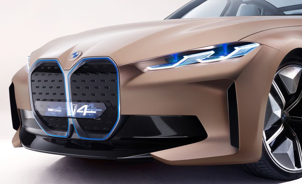
- The new roundel made its debut on the BMW i4 concept this week.
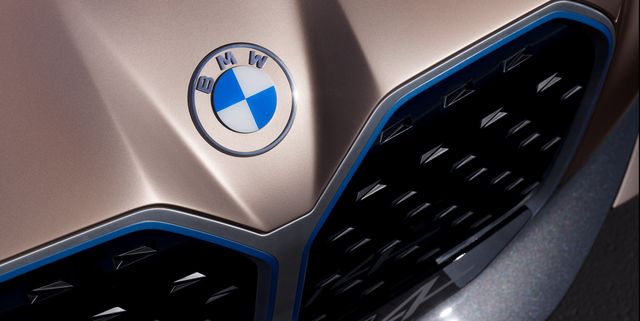
- The logo is not markedly different other than the outer portion is now clear, giving it a different appearance depending on the color of the vehicle it's on.
For only the fifth time since its introduction in 1917, BMW is redesigning its logo, the famous roundel.
While the circular shape and basic architecture are the same, the middle still has the blue and white colors of the Bavarian state from which BMW hails. Yes, we're aware that the blue and white is often thought to be a spinning propeller, to honor BMW's aircraft-engine beginnings, but BMW historians and the public relations department agree that the blue and white is a tribute to Bavaria.
What's new is the retro font that spells out BMW, and that the outer circle is no longer black but clear. So the new badge will take on a different appearance depending on what color of car it's on. When it's stuck to a car, the logo looks entirely new, as the outer section will take on the car’s color. Of course, if it's on a black car it will look similar to the classic badge, but even then, the new font gives it a new and different appearance.
We really like the new look. It modernizes the emblem while acknowledging the 103-year history of the brand.


